
Featured on JDN, the design-information site for people who make, use, and think

Summary of this article
The packaging of the dried-vegetable brand “OYAOYA” has been featured on the design-information site JDN. The packaging, with its colorful hues and eye-catching vegetable illustrations, was created to reach younger generations as well. Comments from Takashi Kuroyanagi of Polar Design, who handled the art direction and package design, are also included.
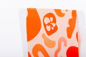
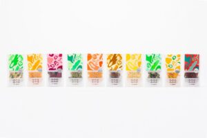
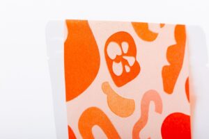
The packaging of the dried-vegetable brand “OYAOYA,” with its eye-catching colorful hues and simple vegetable illustrations. The design, whose deliciousness comes through at a glance, was created to change the previous image of dried vegetables and to reach younger generations. Beyond the packaging, another hallmark of OYAOYA is its use of non-standard vegetables as raw materials. Turning these into products and selling them alongside standard produce involves hurdles in the manufacturing process. We asked Takashi Kuroyanagi of Polar Design, who handled the art direction and package design, to comment on the design ingenuity that solves not only appearance but also those challenges.
Quoted from JDN
Article summary
Title: Mono to Koto OYAOYA
Featured on: https://www.japandesign.ne.jp/products/2023/06/71220/
- OYAOYA, a dried vegetable brand using Kyoto vegetables, wins “Topawards Asia”
- OYAOYA, a dried-vegetable brand using Kyoto vegetables, announces it will become a consolidated subsidiary of global cutlery maker Kai through M&A
Author of this article
Related articles
-
 We were featured in the cosmetics and health food OEM introduction media “OEM Walk”
 -
 Kyotamba Radish Was Featured in BranD Magazine
 -
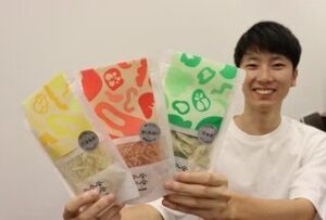 Featured in the Kyoto Shimbun
 -
 CEO Kojima appeared on KBS Kyoto's "Taniguchi Ruru"
 -
 Featured in FRaU SDGs MOOK FOOD, on the future of "delicious"
 -
 Featured in the sustainable media Sustera
 -
 CEO Kojima was interviewed on J-WAVE, which features John Kabira
 -
 Featured in the Nikkei